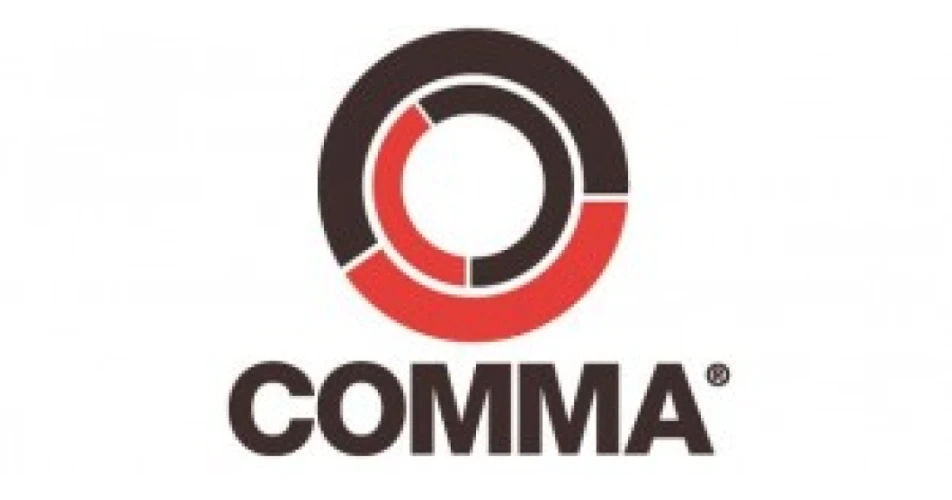
Comma Oil & Chemicals has unveiled a new visual identity for its popular brand. The re-branding includes the introduction of a new strapline and a contemporary new logo.
The new Comma strapline is “'Confidence comes from within”, reflecting the company’s confidence in the quality of its products. Comma says it also shows its customers, motorists, technicians and distributors, that they too can be confident in Comma's products.
The new logo, which marks a major departure from Comma's outgoing red and blue design, is made up of two rings which signify not only the automotive side of the business but also the company's perpetual movement forwards.
The new look continues into its packaging range, as Comma has introduced a new shape pack, which features clean lines and will be used exclusively on the Comma brand.
Comma's image overhaul comes as the manufacturer enters a new era of growth and investment. Established in 1965 as a blender of traditional motor oils, Comma is now owned by leading Brazilian conglomerate, Cosan. Under Cosan, Comma has continued to build on its excellent reputation of product and service quality, with Comma products now available across more than 40 markets worldwide.
Comma spokesman, Mike Bewsey, said, "This is an exciting time for the Comma brand. We are building our presence internationally and we wanted a new identity to reflect this era and our very high quality offer. We needed our identity to be bold, modern and instantly recognisable as Comma. We decided to focus on the theme of confidence as we believe it is essential to our position as a provider of world-class products and of all the support we offer."